Scary Mommy Shop Rebrand
Redesigning the ecommerce shop.
When Scary Mommy was acquired by BDG Media and launched a rebrand of the editorial website. This gave us the opportunity to redesign the e-commerce Shop as well.


Background
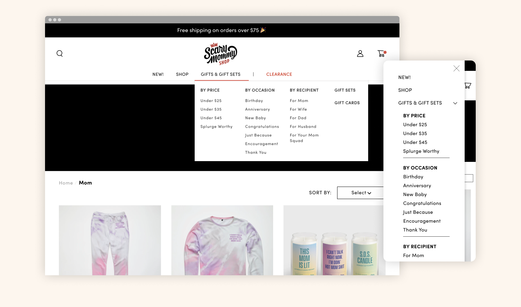
The Scary Mommy Shop featured a variety of merchandise. The main way to shop was to browse, or shop by categories under the “Gifts & Gift Sets” section. On mobile, the navigation menu became a very long list.
Objective
Rework the navigation to better categorize the merchandise
Add a filter feature for a simpler gifting journey
Research
Based on my user testing, I found users often looked for a filter in order to narrow down their search. The rebrand was a good opportunity to refresh the navigation menu, as well as the filter feature further optimizing the gifting experience.
Before the rebrand, we ran an A/B Test on the navigation. Using heat maps, the most clicked areas in the navigation were - Search, Bestsellers, Gift Finder, Shop > Mom. Based on this, I was able to come up with a better categorization of the navigation.
Key Takeaway
Moms are busy, and looking for a gift can be overwhelming when time is limited. Having quickly accessible tools such as the filters, gift finder, larger search bar, can create the best customer experience.
Design
The new rebrand was a fun, modern take on retro that complimented the humorous, unapologetic Scary Mommy voice. The color palette is bold and I wanted to make sure this came across on the Shop site as well.
When I started to apply color, I found that without the context of punchy curated editorial art and photography, the colors felt soft – not quite capturing the bold content of the brand and merchandise.


Through several color explorations, I realized there was an element missing to bring in that punch of color. I brought in a retro shape, and used it as an enclosure for the logo. After working through several color pairing, I landed on a color palette that communicated strong but feminine.
Filter Feature
Throughout our research, users often chose to sort by Price first, then Categories and Occasion. I worked through several explorations for the filters. Ultimately we went with the solution with all the options quickly accessible. On mobile, surfacing the categories visually gives the user quicker access.

Additional high fidelity prototypes for the filters.