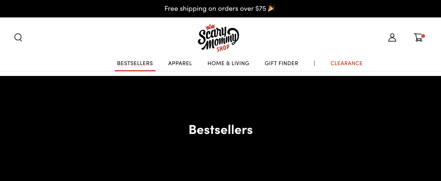
The Scary Mommy Shop - Gift Finder
User testing helped come to the best solution for a gifting journey.

Scary Mommy is a site for moms supporting each other through high, low, and WTF moments of parenting. The voice is humorous and tells it like it is; no sugarcoating, no bullsh*t. The Scary Mommy Shop is an ecommerce site, featuring merchandise that bears clever and often sweary quips, that’s relatable to any mom.
Research
Rather than diving into any redesign based on intuition, we wanted to do the research, pull any data points, and conduct user tests to see what the responses are before moving in any direction.
After some initial competitive research, the team introduced the Gift Finder Quiz on the homepage as a tool for users to browse the merchandise. Using heatmaps, we were able to see that the Gift Finder was by far the most clicked and used feature on the page.
Using this research, we theorized users wanted a better way to navigate the merchandise, and decided to focus on optimizing the Gifts page and navigation.
Objective
Discover new opportunities to optimize the Scary Mommy Shop to make the gifting journey more accessible to the user.

Results:
50% of users preferred to use the current navigation
Liked seeing all categories under “Gifts & Gift Sets”
Many prefer to shop by price
Likes simplicity

Hypothesis 1: Bringing more options to the surface level of the menu, will give users more visibility on products offered, then finding categories quicker.
Results:
50% of users preferred to use the new navigation
Saw all my options right in front of me
Easier to find everything
Clearly labeled but wondering if searching a lot more
Hypothesis 2: Adding and pulling out categories will help narrow down the gift search quicker.
Results:
50% of users preferred to use the Gifts page with the current navigation
“Categories are broken out, making it easier to find items”

Results:
50% of users preferred to use the new Gifts Categories
“Easier to use, would like to be able to shop by price”
Results:
100% of users preferred to use the Gift Finder tool
- Can filter categories easily
- Saves time and frustration
- Wider ranges in gift finder
- Easier to navigate

Hypothesis 3: Adding the Gift Finder on the Gifts page will lead to a quicker search.
Final Thoughts
By testing the initial request, we were able to come up with a better solution for the Scary Mommy Shop Gift Finding experience. This has saved time and resources on both the Design and Engineering team.
The users responded well to the current navigation, and we decided to keep the menu as is. Instead we focused on incorporating the Gift Finder quiz and reworking the filter feature. After our user testing, we found that users needed more guidance in their gift finding experience.
With these user tests in place, we can continue to track and iterate on the new gift shopping experience.
Check out the next phase – the Scary Mommy Shop Redesign